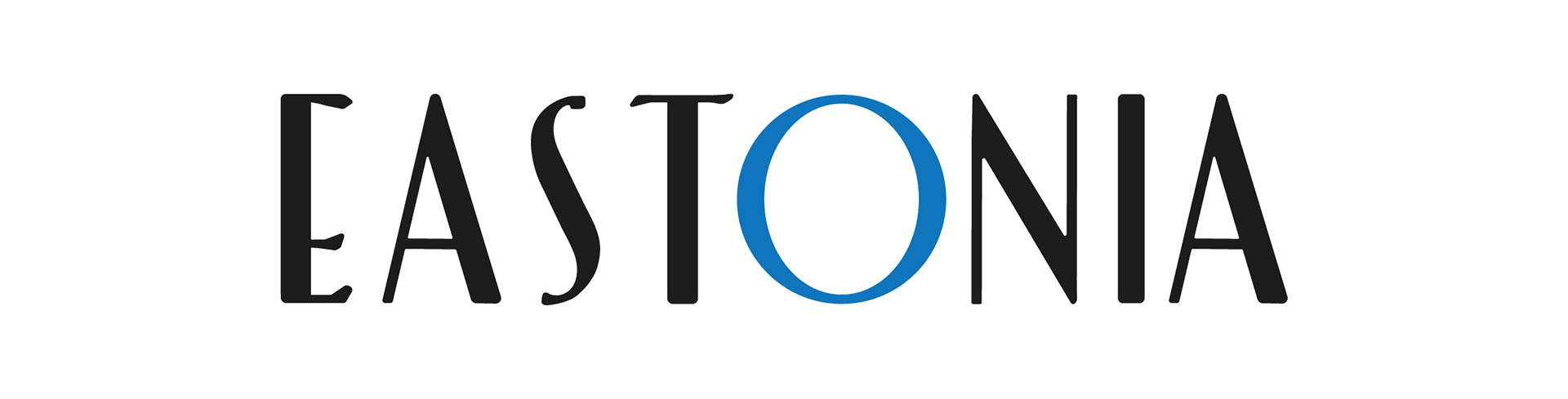
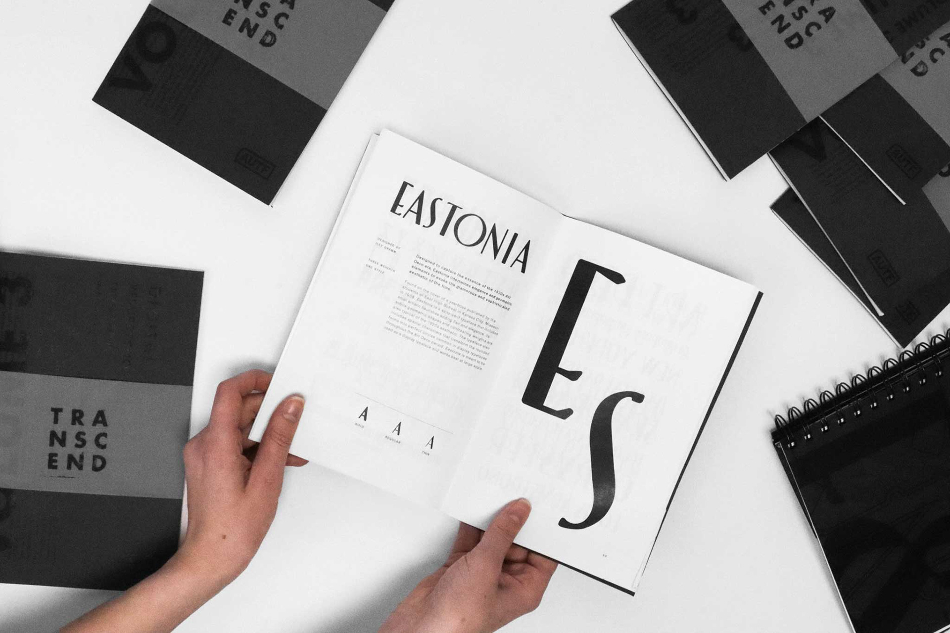
E A S T O N I A :
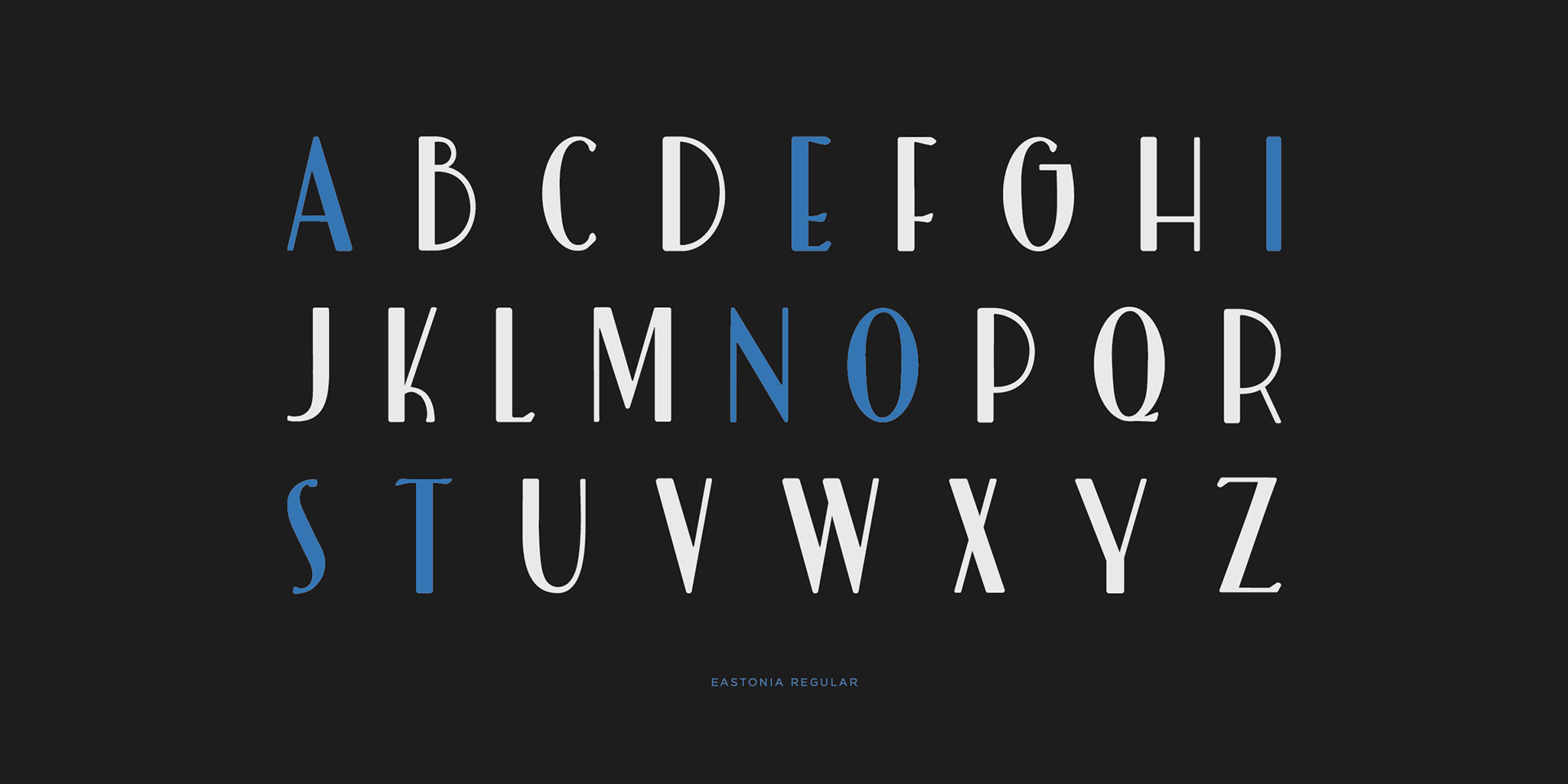
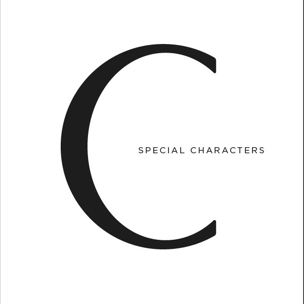
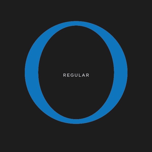
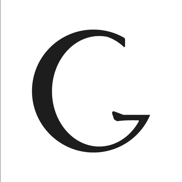
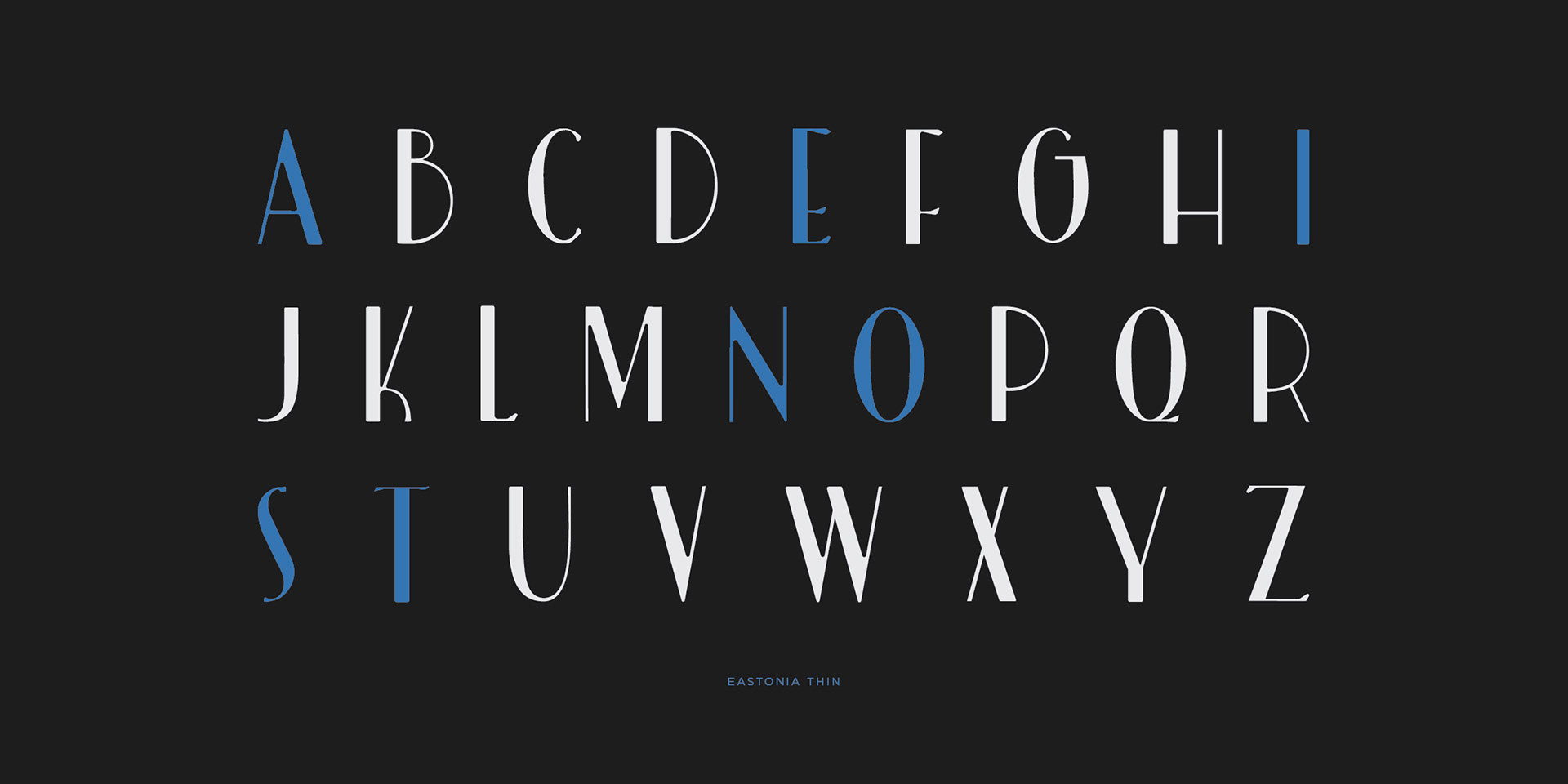
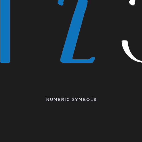
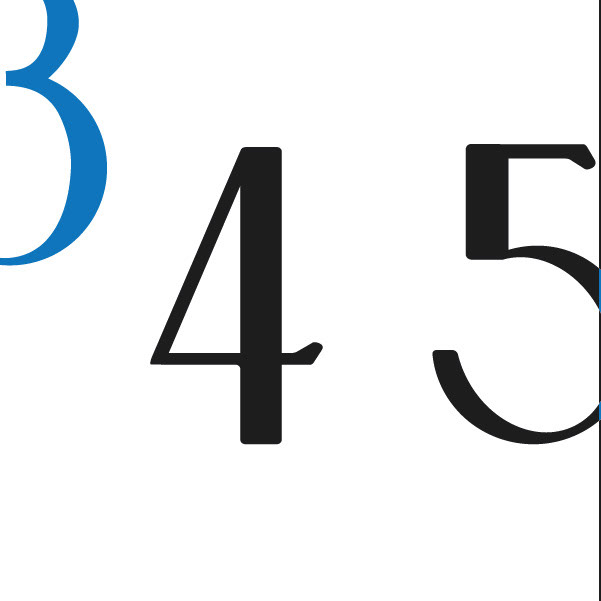
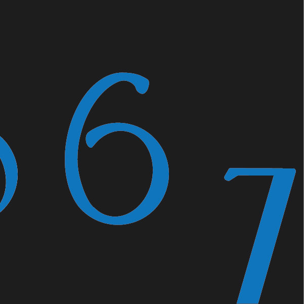
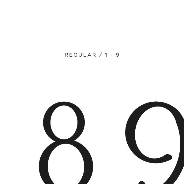
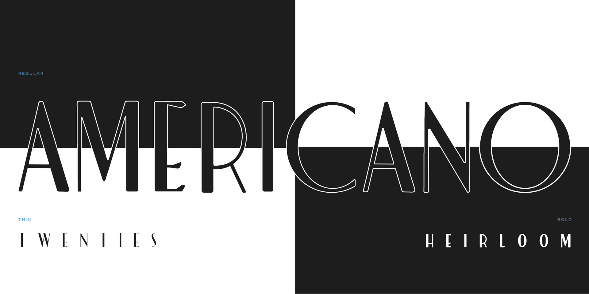
Designed to capture the essence of the 1920s Art Deco era, Eastonia intertwines elegance and geometric elements to evoke the glamorous and sophisticated aesthetic of the time.Found on the cover of a yearbook published by the students of East High School in Kansas City, Missouri in 1938, Eastonia is a sans-serif typeface that includes small artistic flourishes adding flair and elegance. Its subtle geometric shapes and contrasting weights are also typical of the 1920s aesthetic. The typeface also includes special characters that transform the rounded forms into perfect circles common in display typefaces throughout the Art Deco period. Eastonia is meant to be used as a display typeface and works best at large scale.
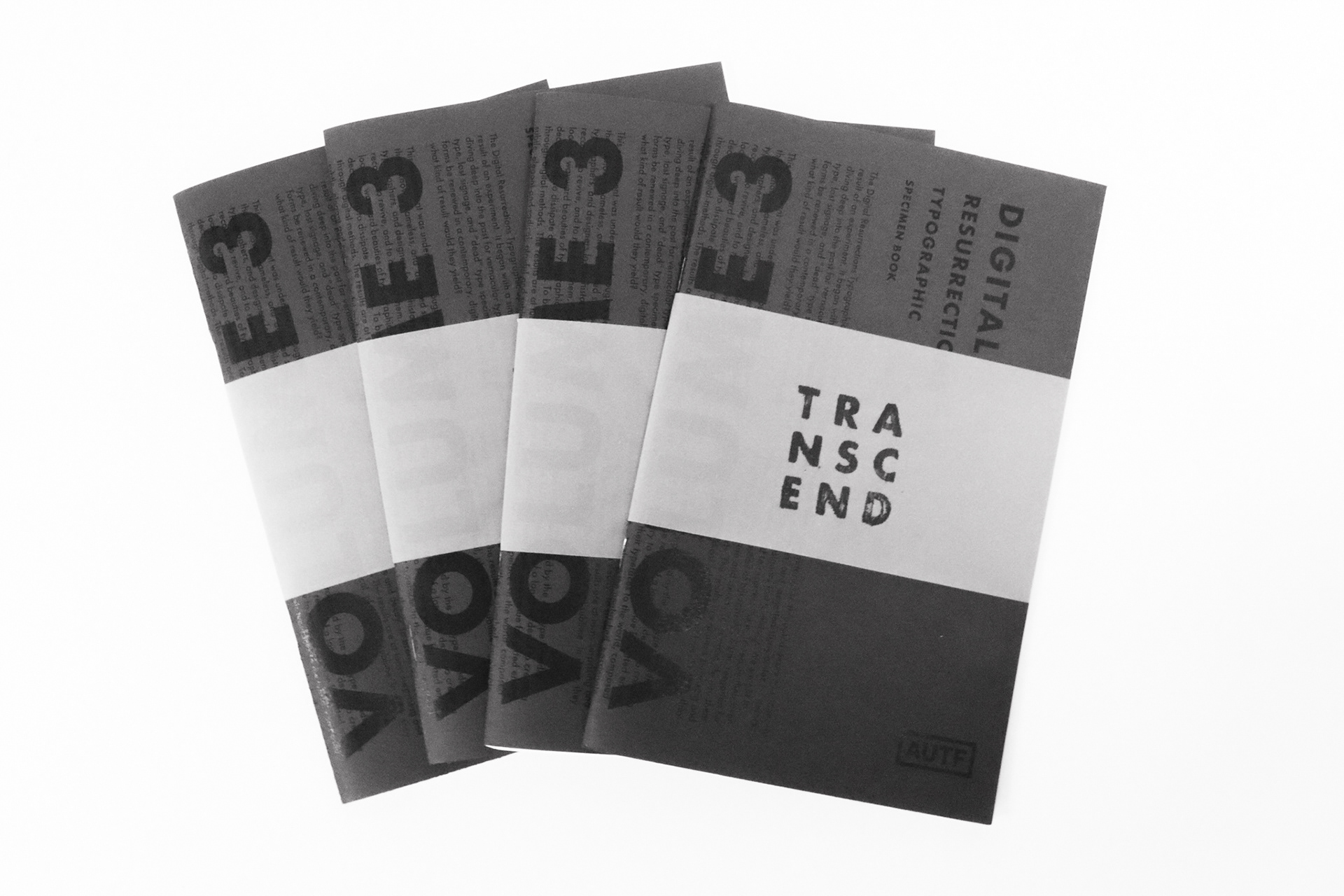
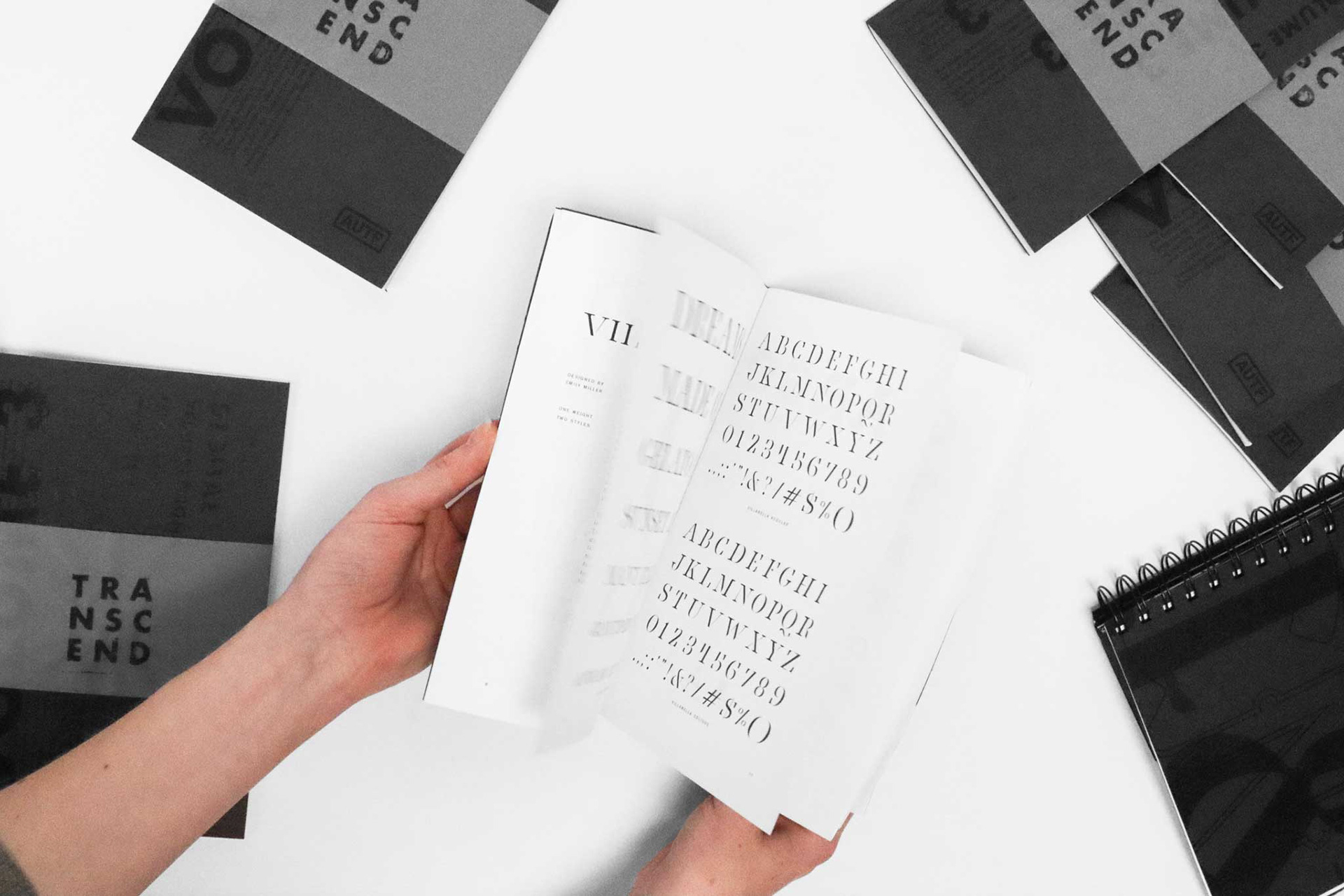
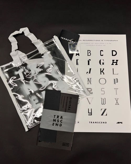
V O L U M E 3 T Y P E S P E C I M E N B O O K S E T :
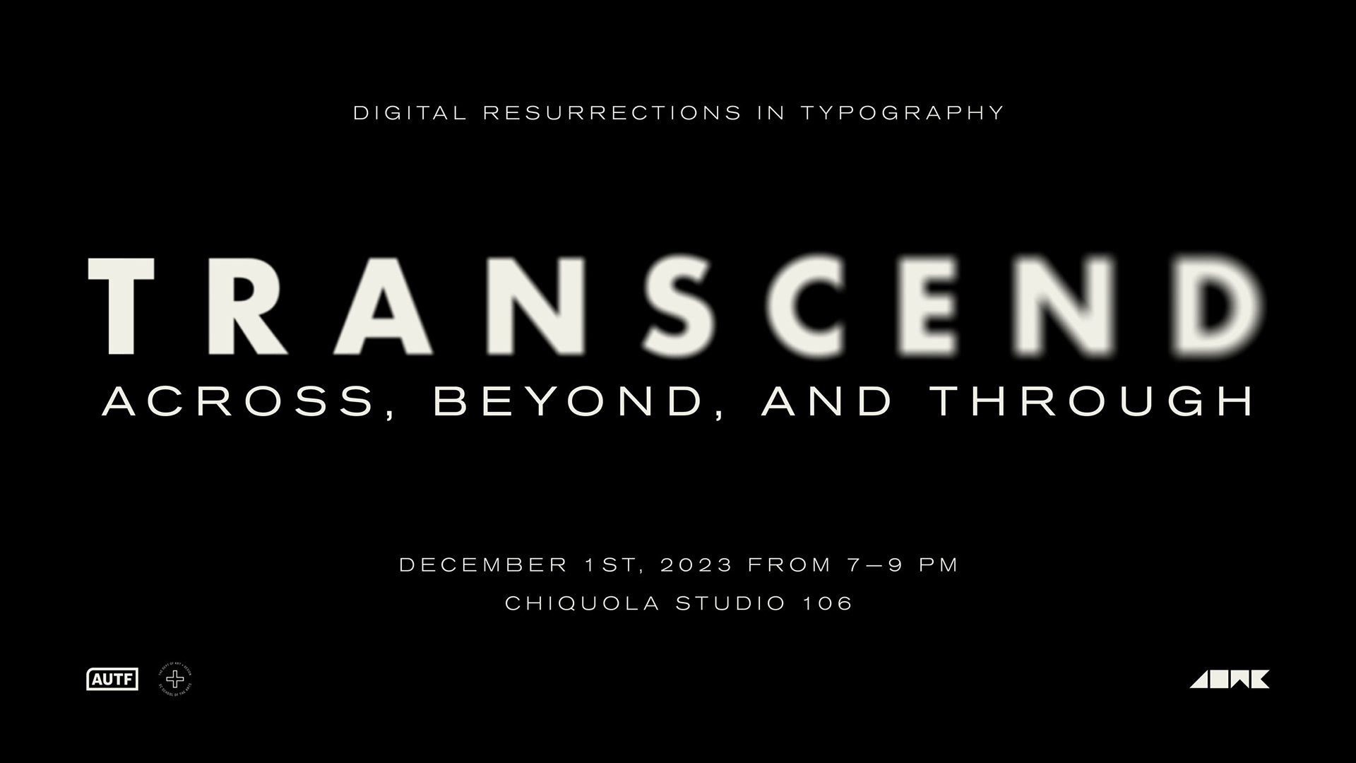
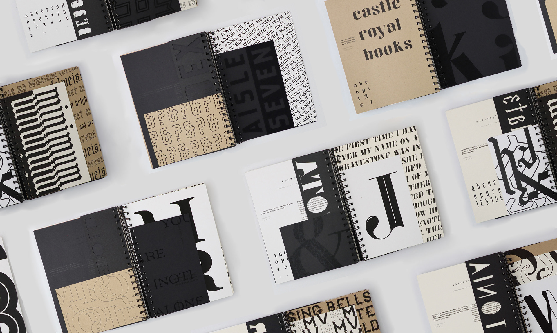
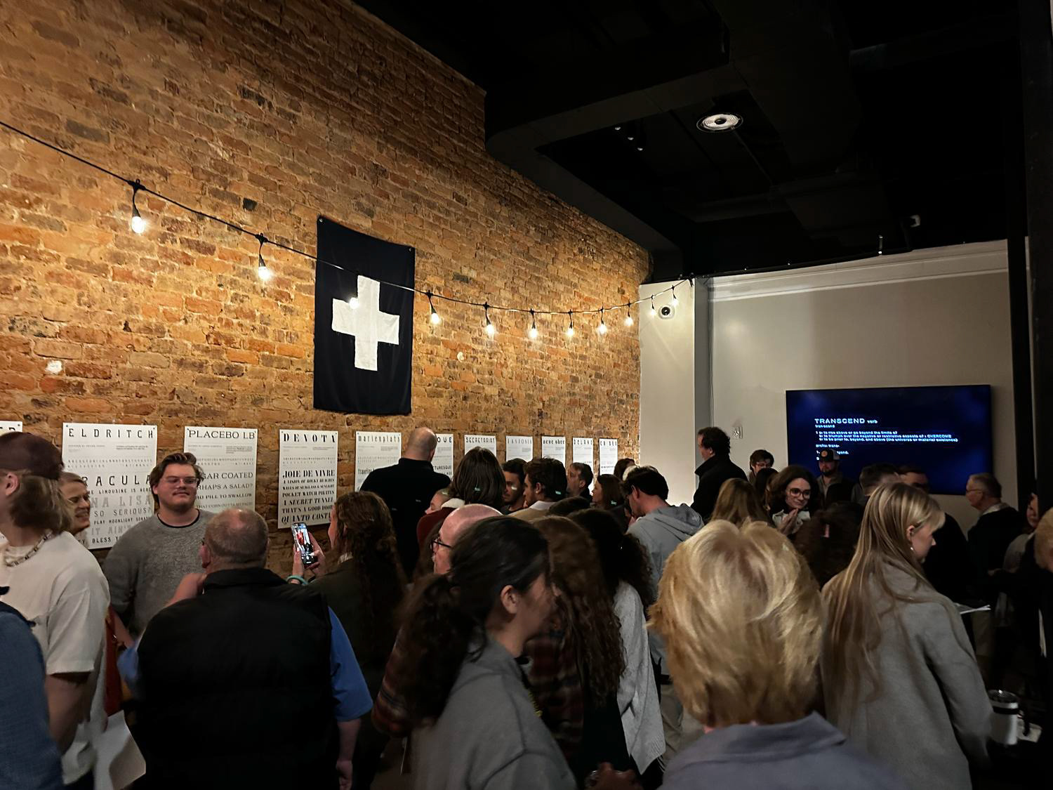
Eastonia was showcased as part of AU Type Foundry’s 2023 Exhibition “Transcend: Across, Beyond, and Through.” Exhibiting a collection of resurrected typefaces, Transcend brings to life a once-lost history of the original makers, the forms they created, and what they created them for. I had the privilege of being part of the team that produced the show book handed out to guests and the specimen book that displays the typefaces in a publication.
P R O J E C T T Y P E :
Typeface Design + Type Specimen Book Design
D E L I V E R A B L E S :
Typeface Design, Type Specimen Books, Transcend Exhibition Design
B O O K C O L L A B O R A T I O N :
Knoxie Le Roux
A W A R D :
★ AAF Gold ADDY Award 2023 - Book Design